Management Systems World
All on Quality and other Standards in one place since 2010. Now Worldwide.
Scatter Diagram
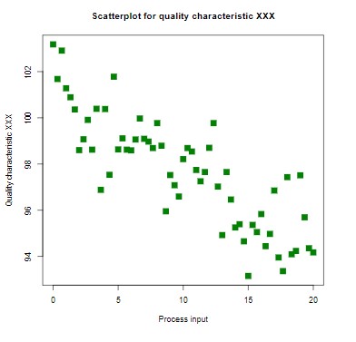
A Scatter Diagram, also known as a Scatter Plot, is a type of chart used in statistics to visually represent the relationship between two variables. Each point on the plot corresponds to a pair of values from the two variables, with one variable placed on the x-axis and the other on the y-axis. Scatter plots are especially useful for identifying patterns or trends, such as correlations, clusters, or outliers. By visually assessing the plot, one can determine if there is a positive, negative, or no relationship between the variables. This makes scatter plots a key tool in quality control and process improvement, allowing analysts to assess potential causes and effects in manufacturing or business processes.
In quality management, scatter diagrams are frequently used to identify potential root causes of issues by comparing different factors, such as production speed and defect rate, or training hours and employee productivity. When the points form a clear upward or downward trend, it suggests a correlation that can guide decisions on process improvements. However, the scatter plot does not prove causality, so it is usually combined with other analytical tools like control charts or Pareto analyses to ensure a more robust understanding of process behavior.
Image credit: By DanielPenfield - Own work, CC BY-SA 3.0
